CAROLINA HURRICANES
These get-ups have been the Hurricane's uniforms since they moved to the Carolinas in 1997, with only minor tweakings happening since then. They traded them in this past offseason for these:
Not bad. I really like the colored pattern on the shoulders, very retro. Beyond that, black has been almost completely removed from the home sweaters and very toned down and concentrated on the away unis. Personally I like the change. The previous uniforms looked a little too similar to the Ottawa Senators' gear, and while these new uniforms are a tad derivative of the Red Wings, they're different enough to where it doesn't really matter. All in all, we're off to a good start.
DALLAS STARS
The Stars introduced these uniforms when Reebok took over as the NHL's uniform manufacturer before the 2007-08 season (the home jerseys anyway, the road ones were introduced as alternates in 2008-09 before becoming the permanent road unis in 2010-11). They're definately more subtle than their old uniforms, but they're also pretty boring. If you're a Stars fan, do you really get excited by these things? If they were playing baseball, it'd be one thing. But in hockey? They just didn't do it for me. And the home uniform has almost no green in it. What's up with that?
Now this is an improvement! The Stars' uniforms haven't been this green since they were the Minnesota North Stars. It's not shown in the picture, but the pants are black and have a green stripe in the center with two white lines parallel to the green one on both sides of it. Snazzy! I'm not crazy about the new logo, but other than that, these uniforms are great. Striking and subtle at the same time. And we're two for two on new uniforms bringing back the colored shoulders! Awesome!
JACKSONVILLE JAGUARS
Yow. Well, I'll give these new uniforms this: they're more Floridaish. Jeff Loria probably shed tears when he saw these babies because they struck him so. Or maybe it was because he realized that he's a terrible person. Whatever comes first with that guy.
On the uniforms themselves... I've got to admit, I think they're really ugly. And tacky. But they are a step up from any other uniform in franchise history (though that's not really saying much). Plus, Florida can get away with crazy shit like this. So against my better judgment, I'll give them a thumbs up.
MIAMI DOLPHINS
The Dolphins haven't really done a lot to their uniforms over the years. These ones that they just replaced were introduced in 1997 as a slightly updated version of their old ones that they wore in the 70s through the 90s, with a darker shade of aqua and and a meaner dolphin on the helmet. But the new uniforms are real departure:
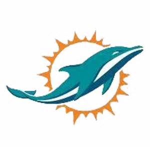
Hot damn, these uniforms are great! They're everything you want in a new uniform, boldly taking the team into the future without disrespecting its past. The aqua got brighter and the numbers are less angular. Plus, white face masks, a Dolphins first! And look at that new aqua stripe! Speaking of the helmet, dig the new logo:
That there is a sleek dolphin. I hope the Dolphins make the Super Bowl just so I can see the hell out of these uniforms. A++!
MINNESOTA VIKINGS
For a team that's steeped in tradition, these uniforms are anything but. They're nice uniforms and all (the road jerseys anyway), but compared to some of their other uniforms of the past, they seem to be a little too out there for my tastes.
That's more like it! Like the Dolphins, the Vikings go back to the past and also the future with this new look. The more traditional stripes on the pants really fit, and I like the new age shoulder stripes. Also, these are the first uniforms to not have an accent color on the numbers since the first ones. Fran Tarkenton would be proud!
NEW ORLEANS PELICANS
That's a lot of stripes. The former Hornets carried over their look and name from their time in Charlotte, and they should have left it all back there. The name and uniforms fit New Orleans like... something that doesn't fit. What, I'm not a thesaurus. Anyway, how do the new uniforms look?
Hey, not bad! While Pelicans are about as intimidating as Don Mattingly without his mustache (back on form!), the name fits Louisiana much better. Plus, no other team in the NBA looks quite like this, so they're striking, original, and snazzy to boot! Good going!
I'll do this again when another team inevitably changes its uniforms. If I learned anything from writing this article, it's that I like to look at pretty colors.
.jpg)
.jpg)
.jpg)
.jpg)
.jpg)
.jpg)
.jpg)
.jpg)
.jpg)

.jpg)


.jpg)
.jpg)


.jpg)
.jpg)

No comments:
Post a Comment